Touchscreens and tablet-sized displays are everywhere in the car world these days, from the highest-tech Teslas to entry-level autos manufactured in emerging world markets. It makes sense, since everyone seems to be carrying a screen or two or three around with them. But what if a car maker went a different way? Is that possible?
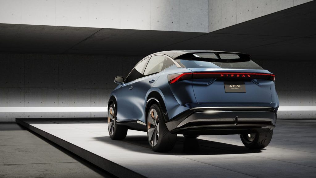
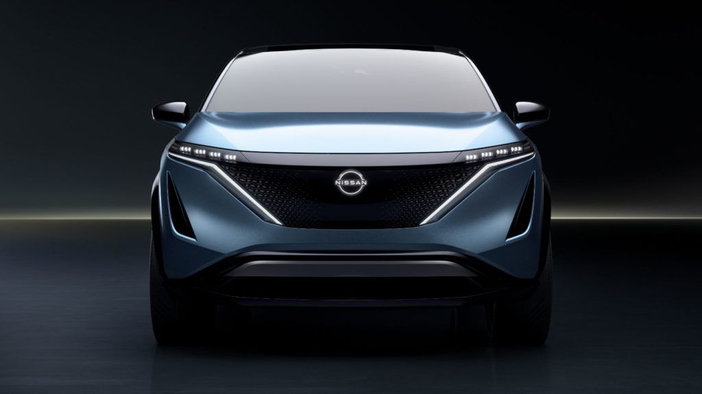
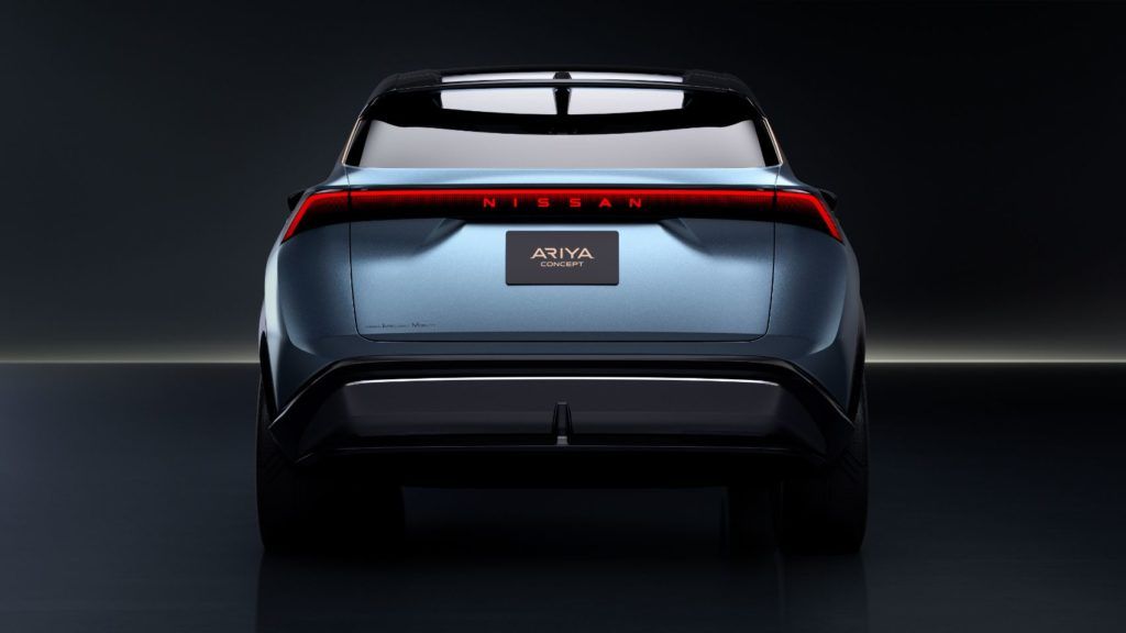
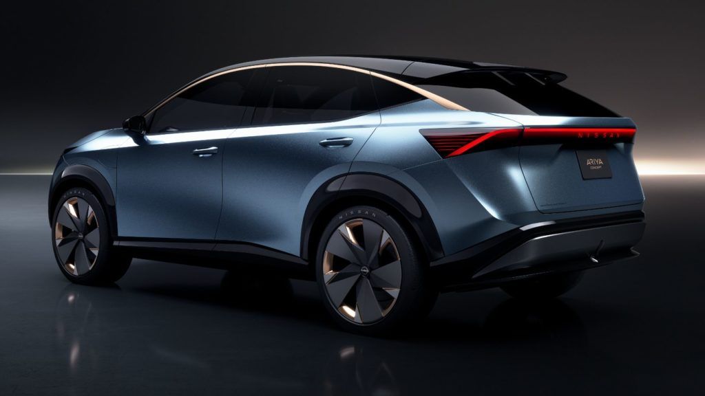
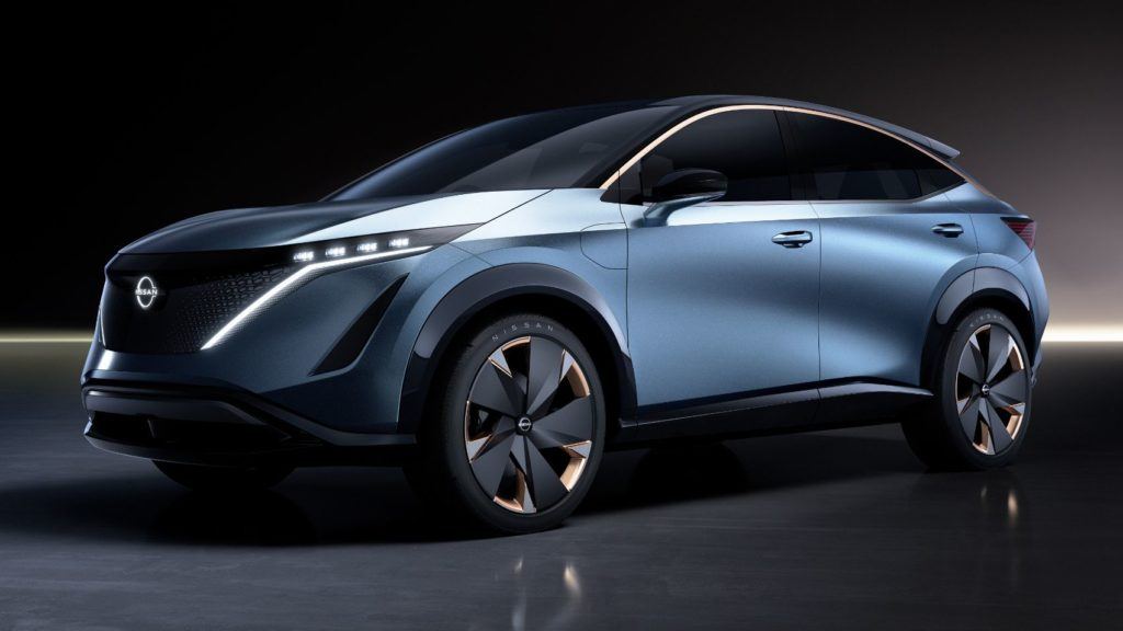
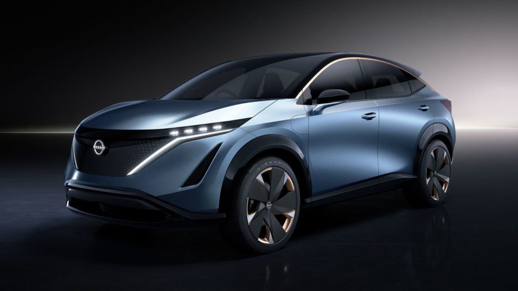
Say hello to the Nissan Ariya Concept, the EV crossover that aims to think differently about how drivers get their information.
What Is The Nissan Ariya Concept?
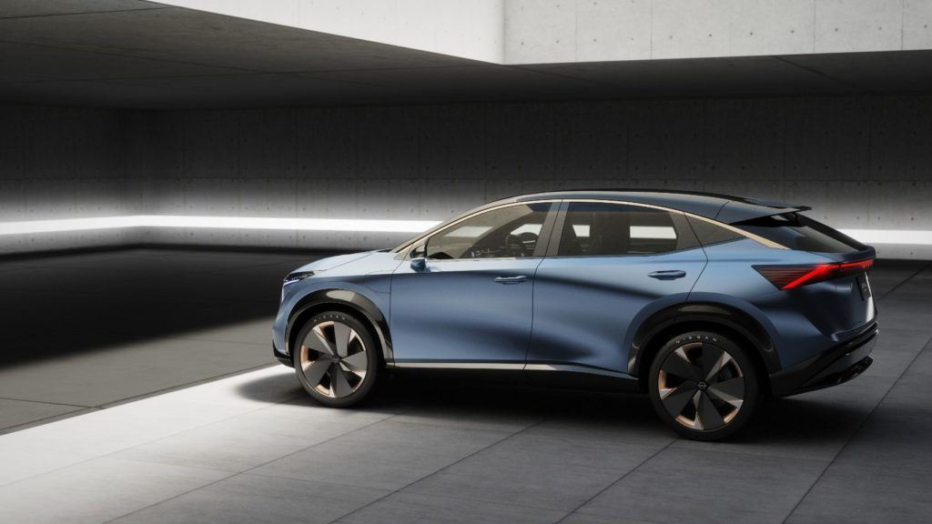
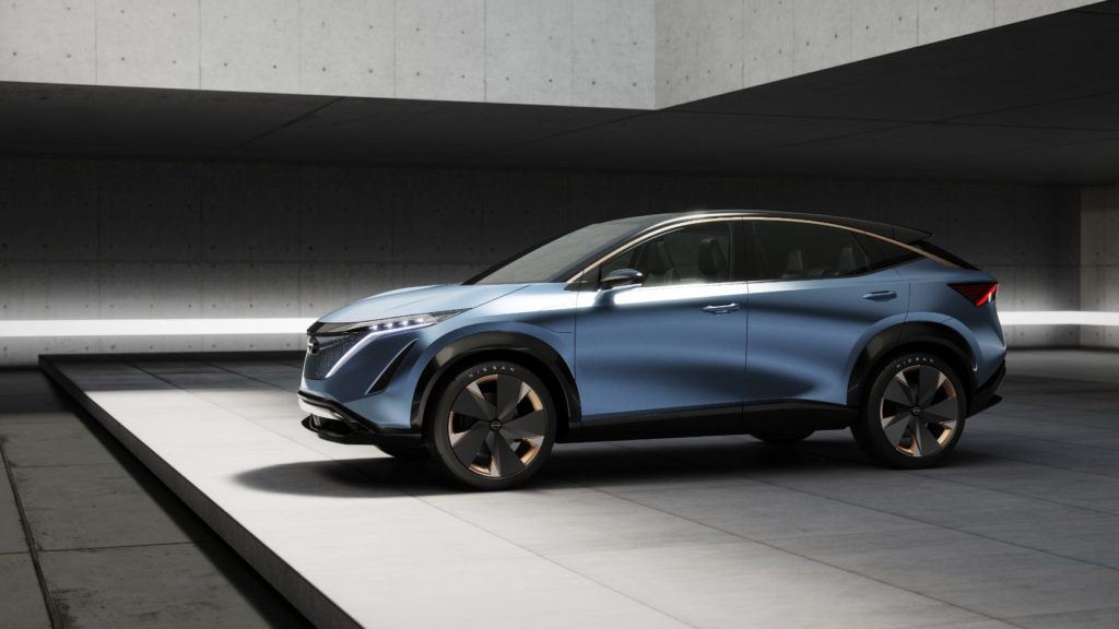
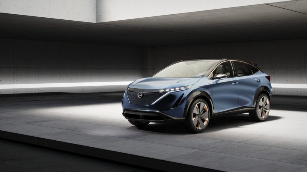
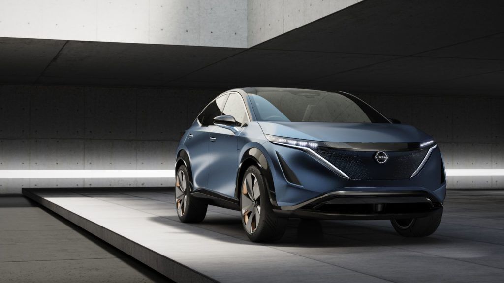
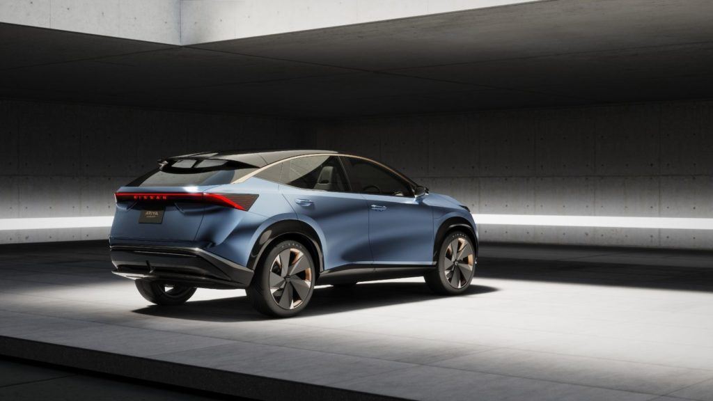
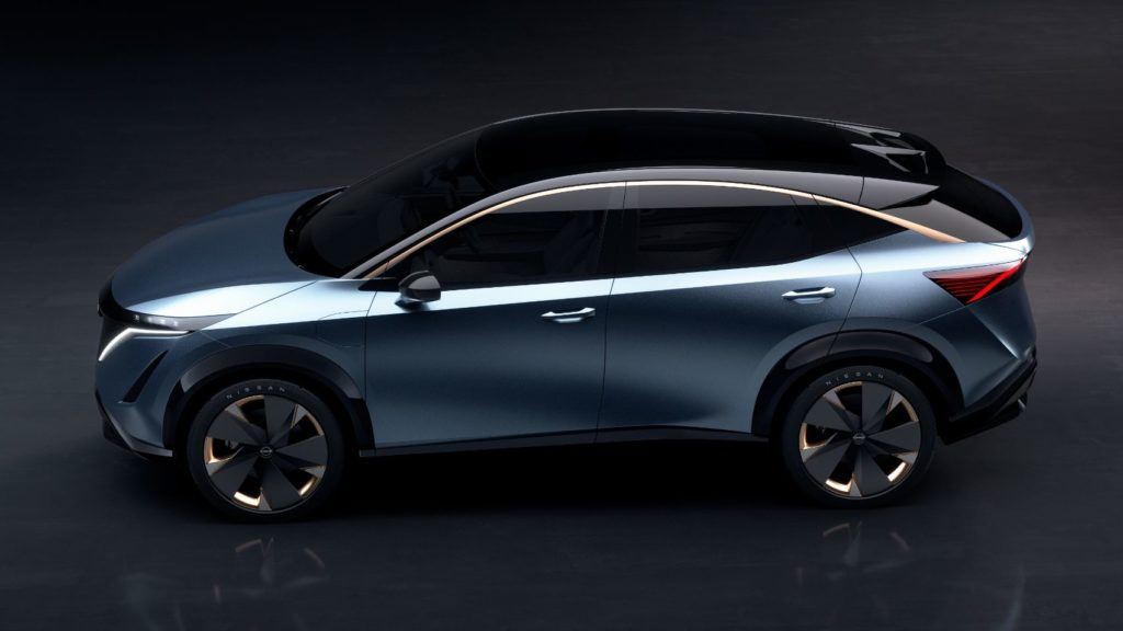
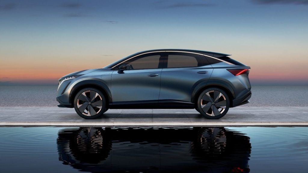
Nissan unveiled the all-wheel drive electric crossover in October at the Tokyo Motor Show. In a lot of ways, you wouldn’t give the Nissan Ariya a second glance. It looks like the Kicks, Nissan’s small SUV, from a few years in the future. Besides that, everything else is pretty futuristic, as you would expect for a concept car. It has an electric drivetrain, a sleek interior design, super fancy wheels, and semi-autonomous capabiliteis, but it’s the dashboard Nissan is particularly proud of.
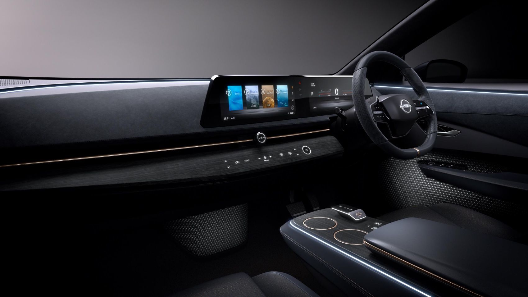
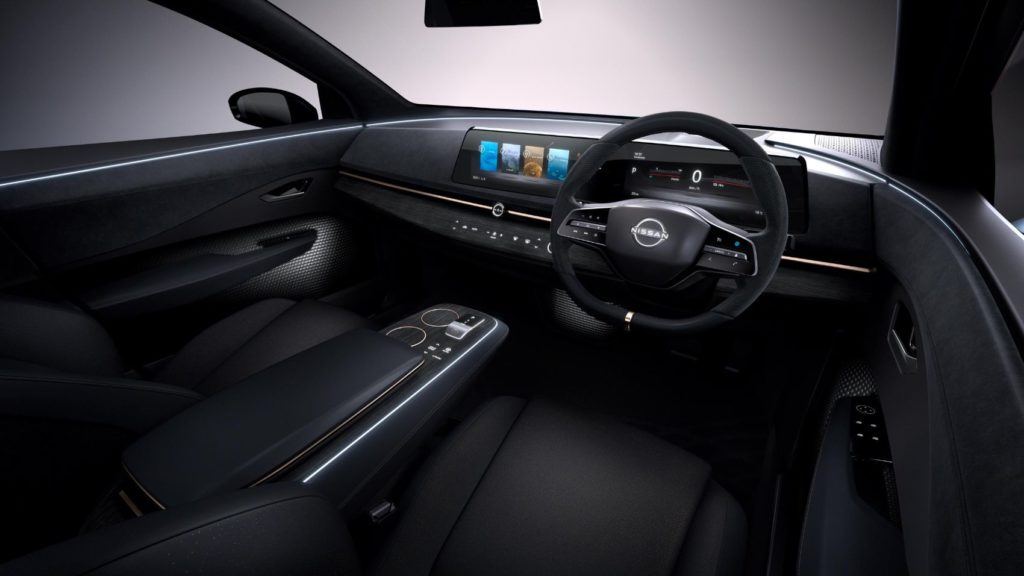
With the Ariya Concept, Nissan doesn’t follow the current trend of nailing a huge plasma screen TV to your dash. Instead, the Ariya Concept has a curved, two-screen display Nissan says is “reminiscent of a wave.” They also say the design gives the interior a sense of “horizon,” from elements in the door all the way to the rear of the cabin.
And that last part seems logical, when you think about it.
The Horizontal View
Your eyes are side by side, not one on top of the other. We see from side to side, which is why computer screens, movie theaters, and TVs are formatted horizontally. And this is why no one should shoot iPhone videos vertically! So Nissan figures not only matching the cabin’s “horizon aesthetic” is a good thing, but going horizontal also conveys information better for the human eye.
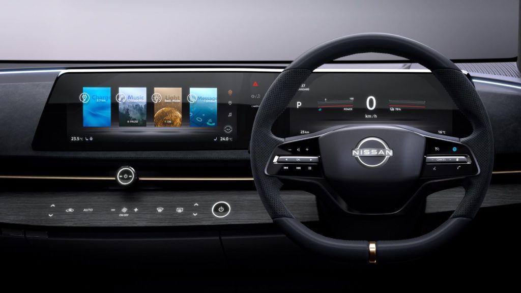
The display keeps the important info on the instrument cluster right over the steering wheel, which is traditional, and also smart from an ergonomics standpoint. Entertainment functions, comfort controls, and system status updates are located in the center screen. Both displays are wrapped in one sleek panel that flows seamlessly between driver and passenger. It looks good (as concept cars do) but it’s functional (as concept cars seemingly never are).
Configurable & Flexible Display
The user experience is configurable at a very granular level. Drivers can adjust how much data is shown on each part of the screen, from navigation to music, while removing unnecessary information from their periphery. Information can move or be swiped between the two screens to create the feeling of a single, integrated display, Nissan says.
If you want your route directions and the map in front of the steering wheel, there they are. If you want to move them to the center, say if your co-pilot is doing the navigating, you can. Or they can disappear entirely when no longer needed. It’s up to you as the driver.
A Work In Progress
The display in the Nissan Ariya Concept looks sleek, seamless and natural, but it didn’t start that way. Nissan’s first iteration of the display was a large black “box” they named “the Monolith,” a nod to 2001: A Space Odyssey. They chipped away, figuratively speaking, at the housing until it became what’s seen here in the final concept car.
By the time the Ariya makes it to production, the display screens should be easy and artful enough to use, even your average caveman could do it.
Tony Borroz has spent his entire life racing antique and sports cars. He is the author of Bricks & Bones: The Endearing Legacy and Nitty-Gritty Phenomenon of The Indy 500, available in paperback or Kindle format. Follow his work on Twitter: @TonyBorroz.
Nissan Ariya Concept Gallery
Photos & Source: Nissan North America.
Original article: Nissan Ariya Concept Ditches Tablet Display for Something More Intuitive
from Automoblog https://ift.tt/2RkwSVJ
No comments:
Post a Comment